Symbol Animations
SFSymbols have slowly been growing, from the size of the library, through to variable colors, and now, we've got built-in animations.
There's a whole new API for us to get to grips with, that gives us simple effects like a symbol fading in and out, and fancier ones like scaling the symbol on a layer by layer basis.
Let's get stuck in.
Types of effect
The new library is based on two sorts of effects, indefinite and discrete.
An indefinite symbol effect, or IndefiniteSymbolEffect, is one that runs forever, until the effect is turned off, or the symbol goes away.
A discrete symbol effect, or DiscreteSymbolEffect, is one that just runs once, on change of a given value.
Some symbols, such as the PulseSymbolEffect, are actually available as both types. Others such as BounceSymbolEffect, are only available as discrete.
Using Effects
The basic way you'll be applying effects is with the new .symbolEffect modifier.
There's two variants of this, one for discrete effects, and one for indefinite.
// Discrete
.symbolEffect(.bounce, value: basketCount)
// Indefinite
.symbolEffect(.pulse.wholeSymbol, isActive: gotMail)
// Discrete
.symbolEffect(.bounce, value: basketCount)
// Indefinite
.symbolEffect(.pulse.wholeSymbol, isActive: gotMail)The discrete effects, which fire once when something changes, require the first argument to be the effect you want, and the second to be the value you'll be monitoring.
Here i'm making a symbol bounce when a basket count changes - think a basket in a shopping app bouncing playfully when you add something to the basket.
The second modifier, for indefinite effects, again takes an effect to start, but this time has a toggle for running or not.
Discrete Effects
There's a couple of discrete effects available to us, here's the ones I've been using in beta one.
VariableColorSymbolEffect
BounceSymbolEffect
PulseSymbolEffect
VariableColorSymbolEffect
BounceSymbolEffect
PulseSymbolEffectLets take a look at the example I have above, a basket that moves playflly when you add to it.
struct AddToBasket: View {
    @State var basketCount: Int = 0

    var body: some View {
        VStack(spacing: 20) {
            Image(systemName: "basket.fill")
                .foregroundColor(.gray)
                .font(.largeTitle)
                .fontDesign(.rounded)
                .symbolEffect(.bounce, value: basketCount)

            Button(action: {
                basketCount += 1
            }, label: {
                Text("Add to basket")
                    .font(.headline.weight(.semibold))
                    .fontDesign(.rounded)
            })
            .foregroundColor(.cyan)
        }
    }
}
struct AddToBasket: View {
@State var basketCount: Int = 0
var body: some View {
VStack(spacing: 20) {
Image(systemName: "basket.fill")
.foregroundColor(.gray)
.font(.largeTitle)
.fontDesign(.rounded)
.symbolEffect(.bounce, value: basketCount)
Button(action: {
basketCount += 1
}, label: {
Text("Add to basket")
.font(.headline.weight(.semibold))
.fontDesign(.rounded)
})
.foregroundColor(.cyan)
}
}
}Running this gives us a basket that bounces nicely when we change our basket count.
We can customise this a little further, by using an optional options parameter.
.symbolEffect(
    .bounce,
    options: .repeat(3),
    value: basketCount
).symbolEffect(
.bounce,
options: .repeat(3),
value: basketCount
)When we apply this effect, we'll get three bounces instead of one. You can also use repeating to have it repeat forever,
The last option is .speed(1) which lets us tell the system to speed up the animation. These can be compounded for more customisation for more custom effects.
.symbolEffect(
    .bounce,
    options: .speed(1.5).repeat(3),
    value: basketCount
).symbolEffect(
.bounce,
options: .speed(1.5).repeat(3),
value: basketCount
)We have one extra option available to us, and its an extra parameter on our initial animation.
Animations have extra properties we can use to tweak slightly. These are different per animation, but there are some consisteneies.
In our bounce example, we can say if we want it to bounce up or down.
.symbolEffect(
    .bounce.down,
    options: .speed(1.5).repeat(3),
    value: basketCount
).symbolEffect(
.bounce.down,
options: .speed(1.5).repeat(3),
value: basketCount
)There's a common option on most effects, byLayer and wholeSymbol, accessed in the same way.
.symbolEffect(
    .bounce.up.wholeSymbol,
    options: .speed(1.5).repeat(3),
    value: basketCount
).symbolEffect(
.bounce.up.wholeSymbol,
options: .speed(1.5).repeat(3),
value: basketCount
)wholeSymbol is self-explanatory, buy byLayer is a little different.
When SFSymbols were brought into this new animated era, they were re-drawn into layers, which can sometimes be animated on their own.
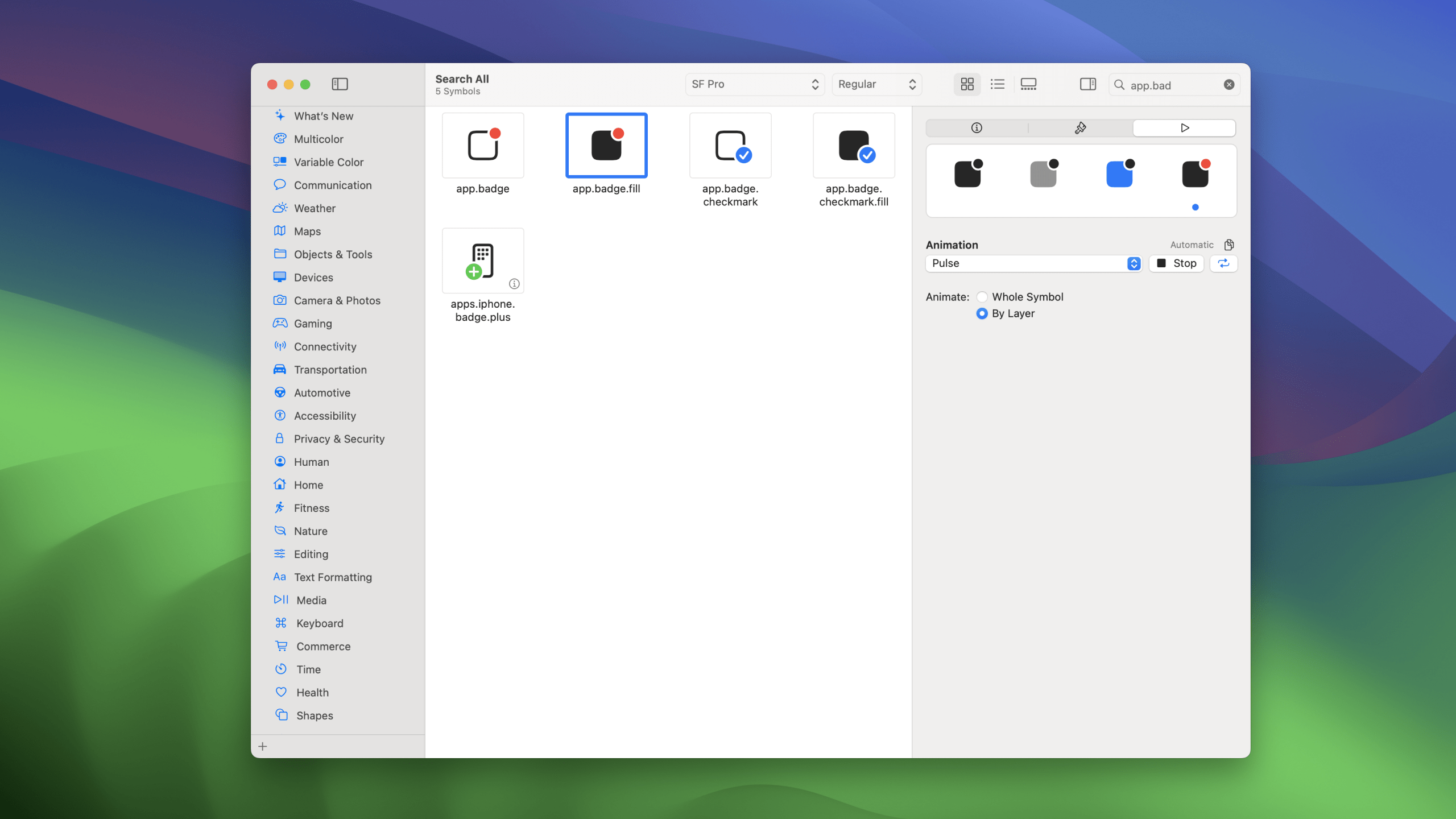
Not all symbols are equal. Our basket for instance, doesn't have any layers to play with, so setting byLayer doesn't do anything. Lets quickly look at an example of one that does, app.badge.fill.
struct AppBadge: View {
    @State var pushes: Int = 0

    var body: some View {
        VStack(spacing: 20) {
            Image(systemName: "app.badge.fill")
                // be sure to give two colors for your badge
                .foregroundStyle(.red, .gray)
                .font(.largeTitle)
                .fontDesign(.rounded)
                .symbolEffect(
                    .bounce.up.byLayer,
                    options: .speed(1.5).repeat(3),
                    value: pushes
                )

            Button(action: {
                pushes += 1
            }, label: {
                Text("Increment")
                    .font(.headline.weight(.semibold))
                    .fontDesign(.rounded)
            })
            .foregroundColor(.cyan)
        }
    }
}
struct AppBadge: View {
@State var pushes: Int = 0
var body: some View {
VStack(spacing: 20) {
Image(systemName: "app.badge.fill")
// be sure to give two colors for your badge
.foregroundStyle(.red, .gray)
.font(.largeTitle)
.fontDesign(.rounded)
.symbolEffect(
.bounce.up.byLayer,
options: .speed(1.5).repeat(3),
value: pushes
)
Button(action: {
pushes += 1
}, label: {
Text("Increment")
.font(.headline.weight(.semibold))
.fontDesign(.rounded)
})
.foregroundColor(.cyan)
}
}
}In this example, when we run our animation, the bounce effect is applied per layer. It's subtle, but it adds extra playfull-ness to the animation.
If we swap out our .bounce for a pulse, we'll get a nice fade that only applies to the badge, not the app itself.
.symbolEffect(
    .pulse.byLayer,
    options: .speed(1.5).repeat(3),
    value: pushes
).symbolEffect(
.pulse.byLayer,
options: .speed(1.5).repeat(3),
value: pushes
)It's important to pause for a second here.
In our first example we made it bounce, and both layers bounced, but when we faded it, only the badge did - why?
This happens because not all symbols are equal, and that applies to animations too. Most symbols with badges exhibit this behaviour, but not all symbols have badges.
The easiest way to determine how a symbol will animate is using SF Symbols 5, which not only lets you preview colors, but now also lets you preview the built-in animations, so you're not caught by surprise.
Indefinite Effects
Indefinite effects are used a little differently, so lets get to know them.
Here's all the effects we have access to ( note that some are overlapping ).
VariableColorSymbolEffect
AppearSymbolEffect
DisappearSymbolEffect
PulseSymbolEffect
ScaleSymbolEffect
VariableColorSymbolEffect
AppearSymbolEffect
DisappearSymbolEffect
PulseSymbolEffect
ScaleSymbolEffectUsing these is even easier than before - you can do it with just one single line.
Let's try it out using a VariableColorSymbolEffect that will change the colors on a wifi symbol repeatedly.
struct Wifi: View {
    var body: some View {
        VStack {
            Image(systemName: "wifi")
                .foregroundStyle(.mint)
                .symbolEffect(.variableColor)
        }
    }
}
struct Wifi: View {
var body: some View {
VStack {
Image(systemName: "wifi")
.foregroundStyle(.mint)
.symbolEffect(.variableColor)
}
}
}As you can see, you can simply provide symbolEffect(.variableColor) for this to work. Because its indefinite, it doesn't need a trigger.
If you did want to control it, you could do so by providing the second argument isActive.
struct Wifi: View {
    @State var isActive: Bool = false

    var body: some View {
        VStack {
            Image(systemName: "wifi")
                .foregroundStyle(.mint)
                .symbolEffect(.variableColor, isActive: isActive)

            Button(action: { isActive.toggle() }, label: {
                Text("Toggle")
            })
        }
    }
}
struct Wifi: View {
@State var isActive: Bool = false
var body: some View {
VStack {
Image(systemName: "wifi")
.foregroundStyle(.mint)
.symbolEffect(.variableColor, isActive: isActive)
Button(action: { isActive.toggle() }, label: {
Text("Toggle")
})
}
}
}Just like with our earlier animations, we get options here too. With wifi as our example, we can use the .iterative and .hideInactiveLayers, option to show each bar on its own, instead of each bar plus the previous bars.
Iterative will make sure only the current bar is filled, and then hiding inactive removes those that aren't filled.
.symbolEffect(
    .variableColor.iterative.hideInactiveLayers,
    isActive: isActive
).symbolEffect(
.variableColor.iterative.hideInactiveLayers,
isActive: isActive
)We can now have a great effect where if the wifi is connecting we show a variable color like this, and if its connected, we just show the full symbol.
Just like with our other effects, there's some special tricks here for certain symbols, like those with badges.
If we re-visit our previous example, we can actually get an infinite pulse with just one line, if we use a new indefinite effect.
Image(systemName: "app.badge.fill")
    .foregroundStyle(.red, .gray)
    .font(.largeTitle)
    .fontDesign(.rounded)
.symbolEffect(.pulse)Image(systemName: "app.badge.fill")
.foregroundStyle(.red, .gray)
.font(.largeTitle)
.fontDesign(.rounded)
.symbolEffect(.pulse)We've not used
byLayerhere, as the default for this symbol uses the layer.
I'd definetley reccomend playing with the options you have - you can make something pretty great really easily.
Content Transition & Replace Effect
Sometimes we want these effects to happen as the result of a change, and that change will also change the symbol itself.
There's an API for that using the same techniques we're used to for text changes, which allows us to trigger a symbolEffect as a result of a content transition - and it doesn't require an explicit animation.
Let's look at a simple example that changes between a sun and moon.
struct SunMoonSimple: View {
    @State var symbol: Symbol = .sun

    var body: some View {
        VStack(spacing: 20) {
            Image(systemName: symbol.name)
                .font(.largeTitle)
                .frame(height: 40)

            Picker(selection: $symbol, content: {
                ForEach(SunMoonSimple.Symbol.allCases, id: \.self) { symbol in
                    Text(String(describing: symbol).localizedUppercase)
                }
            }, label: {
                Text("Symbol")
            })
            .pickerStyle(.segmented)
        }
        .padding()
    }

    enum Symbol: Hashable, CaseIterable {
        case sun, moon

        var name: String {
            switch self {
            case .sun: return "sun.max.fill"
            case .moon: return "moon.fill"
            }
        }
    }
}
struct SunMoonSimple: View {
@State var symbol: Symbol = .sun
var body: some View {
VStack(spacing: 20) {
Image(systemName: symbol.name)
.font(.largeTitle)
.frame(height: 40)
Picker(selection: $symbol, content: {
ForEach(SunMoonSimple.Symbol.allCases, id: \.self) { symbol in
Text(String(describing: symbol).localizedUppercase)
}
}, label: {
Text("Symbol")
})
.pickerStyle(.segmented)
}
.padding()
}
enum Symbol: Hashable, CaseIterable {
case sun, moon
var name: String {
switch self {
case .sun: return "sun.max.fill"
case .moon: return "moon.fill"
}
}
}
}When you tap on the picker, the symbol changes, but without animation.
Let's get animating.
We need to use the contentTransition modifier, alongside symbolEffect together.
Image(systemName: symbol.name)
    .font(.largeTitle)
    .frame(height: 40)
    .contentTransition(
        .symbolEffect(.replace)
)Image(systemName: symbol.name)
.font(.largeTitle)
.frame(height: 40)
.contentTransition(
.symbolEffect(.replace)
)You won't be able to use every effect in this way.
If you tap now, even without an explicit animation on the view, you'll get the change to be nicely animated.
There's more we can do here too, just like before, with options.
For the replace animation, you can actually decide how the outgoing and ingoing symbols scale. My go-to is downUp, which scales down the outgoing and scales up the incoming.
.contentTransition(
    .symbolEffect(.replace.downUp)
).contentTransition(
.symbolEffect(.replace.downUp)
)If you want to get a little fancier, you can combine these effects with existing animations.
Here I've changed the color alongside the transition, which will require an explicit animation.
struct SunMoon: View {
    @State var symbol: Symbol = .sun

    var body: some View {
        VStack(spacing: 20) {
            Image(systemName: symbol.name)
                .font(.largeTitle)
                .frame(height: 40)
                .foregroundStyle(symbol == .moon ? Color.blue.gradient : Color.orange.gradient)
                .contentTransition(
                    .symbolEffect(.replace.upUp)
                )

            Picker(selection: $symbol, content: {
                ForEach(SunMoon.Symbol.allCases, id: \.self) { symbol in
                    Text(String(describing: symbol).localizedUppercase)
                }
            }, label: {
                Text("Symbol")
            })
            .pickerStyle(.segmented)
        }
        .animation(.linear, value: symbol) // Only needed for the color
        .padding()
    }
}
struct SunMoon: View {
@State var symbol: Symbol = .sun
var body: some View {
VStack(spacing: 20) {
Image(systemName: symbol.name)
.font(.largeTitle)
.frame(height: 40)
.foregroundStyle(symbol == .moon ? Color.blue.gradient : Color.orange.gradient)
.contentTransition(
.symbolEffect(.replace.upUp)
)
Picker(selection: $symbol, content: {
ForEach(SunMoon.Symbol.allCases, id: \.self) { symbol in
Text(String(describing: symbol).localizedUppercase)
}
}, label: {
Text("Symbol")
})
.pickerStyle(.segmented)
}
.animation(.linear, value: symbol) // Only needed for the color
.padding()
}
}Thanks for reading this quick look at symbol effects! I'm having fun adding little sparks of joy throughout my app, and I hope you do too.
My code is on Github as always, and you'll find me over on twitter @SwiftyAlex.